

7 experiments before you spend more on ads
20 minutes each, zero new campaigns.

📆 Friday, 27 Jun 2026
Hey — It's Rhythm. Thrilled to have you back in Ecom Circle, where I spend my time scaling ecom brands & finding best growth strategies to share with you.
Every store owner I’ve sat across from wants the same thing — more traffic. Better creatives, lower CPMs, bigger budgets. And honestly, I understand the instinct. Traffic feels like the problem because it’s the most visible thing on the dashboard.
But after working across enough stores, I’ve stopped believing that. Most of the time, traffic isn’t what’s broken. The store is.
You’re paying good money to get people in — and somewhere between the landing page and checkout, a lazy collection title or a mandatory phone number field is sending them right back out. The brutal part is you’d never know. Your dashboard just shows a flat CVR and you go back to the ad account looking for answers.
The answers aren’t there. They’re on the store.
Here are 7 experiments worth running before you spend another dollar on ads. Some take 20 minutes. One generated $150K in new revenue without changing a single campaign.
Experiment 1: Your app drawer is a silent site-killer
Here’s the most boring CRO hack that still works: open your Shopify app list. Go through it one by one. Delete every app you are not actively using this week.
Every installed app, used or not, tends to inject scripts into your storefront. Those scripts load on every page. Page speed is a conversion rate — not a technical metric. Google’s data has shown for years that every second of added load time compounds drop-off at checkout.
The experiment: audit your apps today. Remove anything that’s been sitting idle for 30+ days. Retest your PageSpeed score before and after. The delta will likely surprise you.
You don’t need a faster theme. You need fewer apps.
Experiment 2: Stop asking for a phone number to complete a purchase
We’ve run this across multiple stores. When the phone number field was marked as required at checkout, we removed the requirement. What happened:
+22% increase in global conversion rate across the stores tested.
And here’s the part that actually matters: 70% of customers still voluntarily entered their phone number when it was optional.
The friction wasn’t the field itself. It was the mandatory nature of it. People don’t want to feel like they’re handing over contact info as a condition of buying something. Make it optional, and most of them give it anyway — because they want shipping updates.
If your checkout currently requires a phone number, remove that requirement today and measure for two weeks. This is one of the highest-leverage, lowest-effort checkout tests you can run.
Experiment 3: The collection page header is wasted real estate
Most stores leave the title on collection pages as the default: “Men’s T-Shirts.” That’s not a headline. That’s a label.
One test on a reformatted collection title generated $150,000+ in new revenue. Not from new traffic. From the same visitors, converting at a higher rate — because the headline gave them a reason to keep browsing.
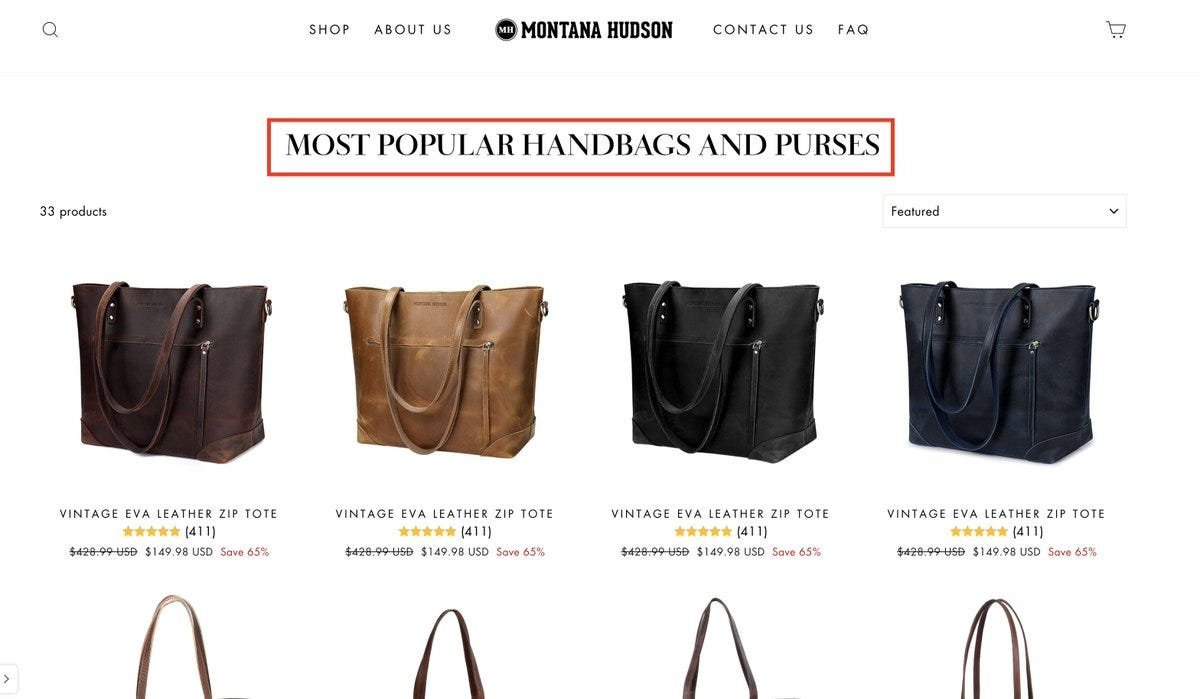
Three formats worth testing:
“Most Popular [Collection Name]”
“[Brand Name] [Collection Name]”
“Top [Collection Name]”
These work because they shift the frame. Instead of “here are our products,” they signal “here’s what’s worth your time.” That’s a different psychological contract with the visitor. Run these as A/B tests, not gut-feel swaps.
Quick one: reply with CRO and we’ll send you our 25-point store audit — the same checklist we run before touching a single line of code on a client store.
Experiment 4: Bundle anchoring on collection pages (the True Classic playbook)
True Classic does something quietly brilliant on their collections pages: they surface bundle options directly, and they order them so the 6-pack appears before the 3-pack.
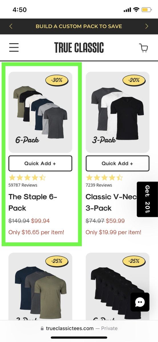
This is anchoring in action. When you see a 6-pack first, the 3-pack reads as the moderate option — not the large one. By the time you get to a single-unit product, it looks like the smallest possible commitment. AOV climbs because the entry point of “reasonable” has shifted upward.
Worth testing: add bundle options to your collection page grid, and deliberately sequence them largest to smallest. Measure AOV and revenue-per-session against your control.
The 6-pack isn’t converting everyone. But it’s making the 3-pack feel like a no-brainer — and that’s doing most of the work.
Experiment 5: Cold traffic doesn’t know your product name — give them a headline instead
When someone comes in from a Facebook ad or a YouTube pre-roll, they land with zero brand familiarity. Dropping them on a standard product page — where the main text is just the product name — asks them to do too much work too fast.
A “cold lander” (a dedicated landing page, not your standard PDP) consistently outperforms direct-to-PDP for paid traffic. The reason isn’t layout or trust badges. It’s almost entirely the headline.
A cold visitor reads a full descriptive headline. Something like “The Last T-Shirt You’ll Buy Before You Stop Replacing T-Shirts” does more work in 2 seconds than your product title and three bullet points combined.
Test to run: duplicate your top product page. Swap the product title for a 10–15 word descriptive headline. Send paid cold traffic to both. Measure CVR and time-on-page.
The headline is doing the job the ad creative already started. Your product title isn’t.
Still with us? Reply CRO — we have 20 more of these, plus a full breakdown of where most DTC stores leak revenue before visitors even reach the cart.
Experiment 6: Your sticky ATC bar needs social proof baked in
If you’re running a sticky add-to-cart button — and you should be — it’s probably just floating at the bottom of the screen with your price and a button. That’s leaving conversion on the table.
The sticky bar is always visible. Which means it’s always an opportunity to reinforce the purchase decision, not just facilitate it. Embedding a review snippet or a star rating directly in the bar gives undecided visitors a signal at the exact moment they’re scrolling through doubt.
The test: add your aggregate review score (e.g. “★★★★★ 4.8 from 2,400+ reviews”) to your sticky ATC component. Compare add-to-cart rate and checkout initiation against your baseline.
Visual social proof in the bar outperforms text-only because it scans faster. Even two seconds faster matters at scroll speed.
Experiment 7: The second PDP image slot is your highest-converting real estate you’re probably not using
Most brands load their product image carousel like this: hero shot, then more hero shots. Maybe a lifestyle image third.
Here’s what the data points toward: the second image in the carousel gets significant engagement, and it’s a natural moment where the visitor is deciding whether to keep looking. A UGC photo or customer testimonial image at slot two does meaningful work on conversion rate.
What works in slot 2: customer photos with real context, UGC video thumbnails, before/after comparisons.
What doesn’t work in slot 1: video. Leading with a video in the first carousel position consistently underperforms vs. a strong static hero image. Don’t bury your best shot.
The intuition here: slot one gets the aesthetic judgment (”does this look like something I’d buy?”). Slot two gets the social validation (”do people who bought this like it?”). Don’t serve them both the same type of content.
Want the full picture?
These 7 experiments are a starting point. The full audit goes deeper — across your PDP, checkout flow, homepage, mobile experience, and ad landing pages. We look at 25 specific friction points that reliably kill conversion on DTC stores, and we tell you exactly where to look on yours.
25-point CRO audit
Checkout friction teardown
PDP scoring framework
Mobile UX red flags list
AOV lever breakdown
Cold traffic landing page guide
Just hit reply and type CRO. That’s it. We’ll send everything over — no form, no calendar link, no sales call required.