

The photo type that outperforms a 5-star review
This and 5 other product images worth stealing

📆 Friday, 19 Jun 2026
Hey — It's Rhythm. Thrilled to have you back in Ecom Circle, where I spend my time scaling ecom brands & finding best growth strategies to share with you.
Every product page has the same three images. White background hero shot, a lifestyle photo, maybe a size comparison if someone on the team remembered. Customers have seen so many of these that their eyes slide right past them now. The image isn’t doing any selling anymore, it’s just confirming the product exists.
The brands pulling ahead aren’t using better lighting or a more expensive camera. They’re using image types that do a specific psychological job, not just a documentation job. Here are six worth testing.
1. Floating product shots
Lemme does this with their supplements, suspending the gummies mid-air with swirling cinnamon and fruit around them like the product is defying gravity. It shouldn’t work. It’s obviously not how the product actually sits on a shelf.
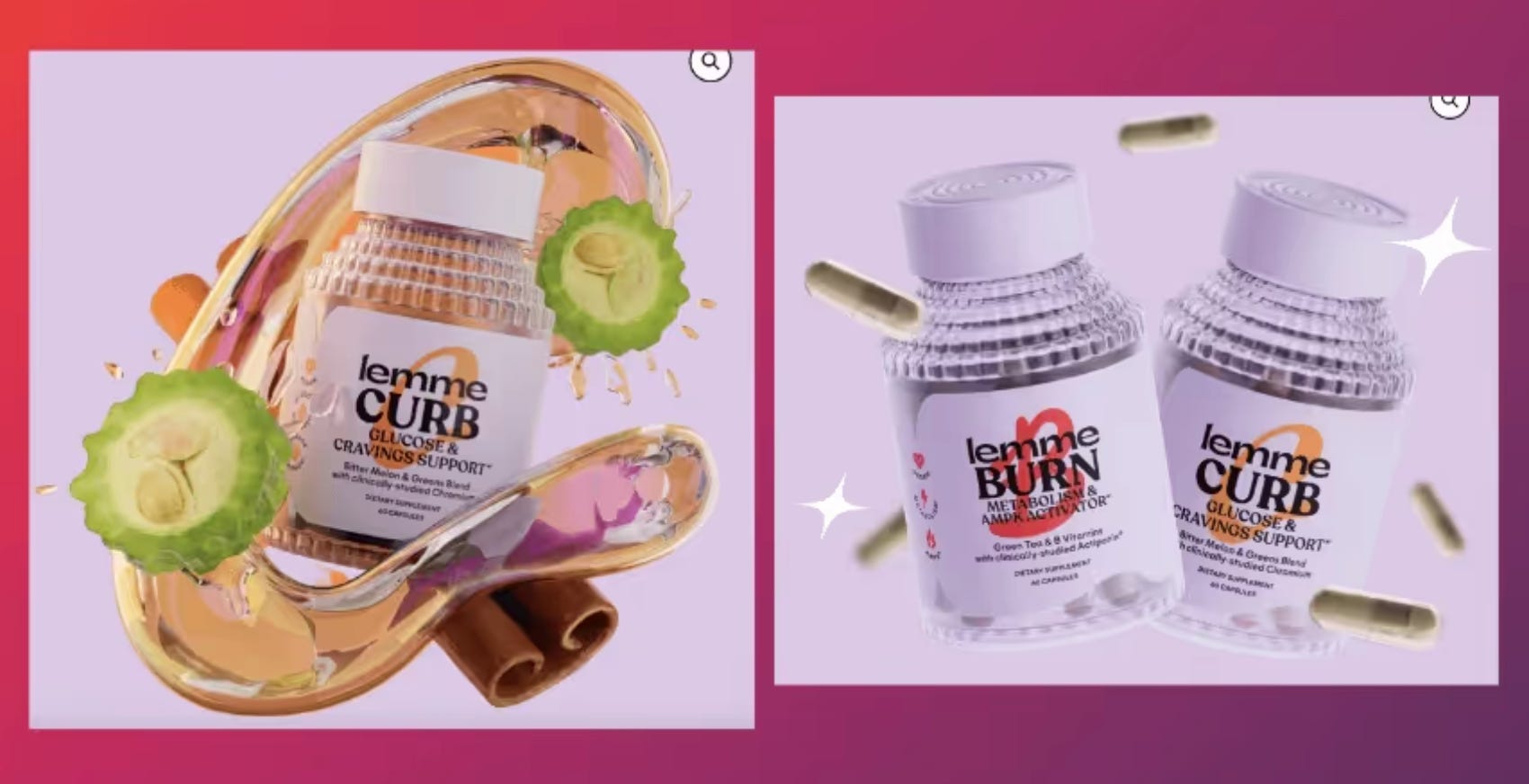
That’s exactly why it works. A floating object breaks the scroll pattern because the brain expects gravity and doesn’t get it. There’s a half second of “wait, what’s going on here” before the eye resolves the image, and that half second is more attention than a static product shot ever earns.
This only works for products people already understand functionally. The photo isn’t there to explain what the thing is, it’s there to make them stop scrolling. Supplements, cosmetics, and anything liquid or powder-based are the best fit.
2. Texture-in-motion shots
Hello Sunday squeezes their lip SPF mid-application, capturing the exact moment the product is moving. Not the tube, not the finished swatch. The motion itself.
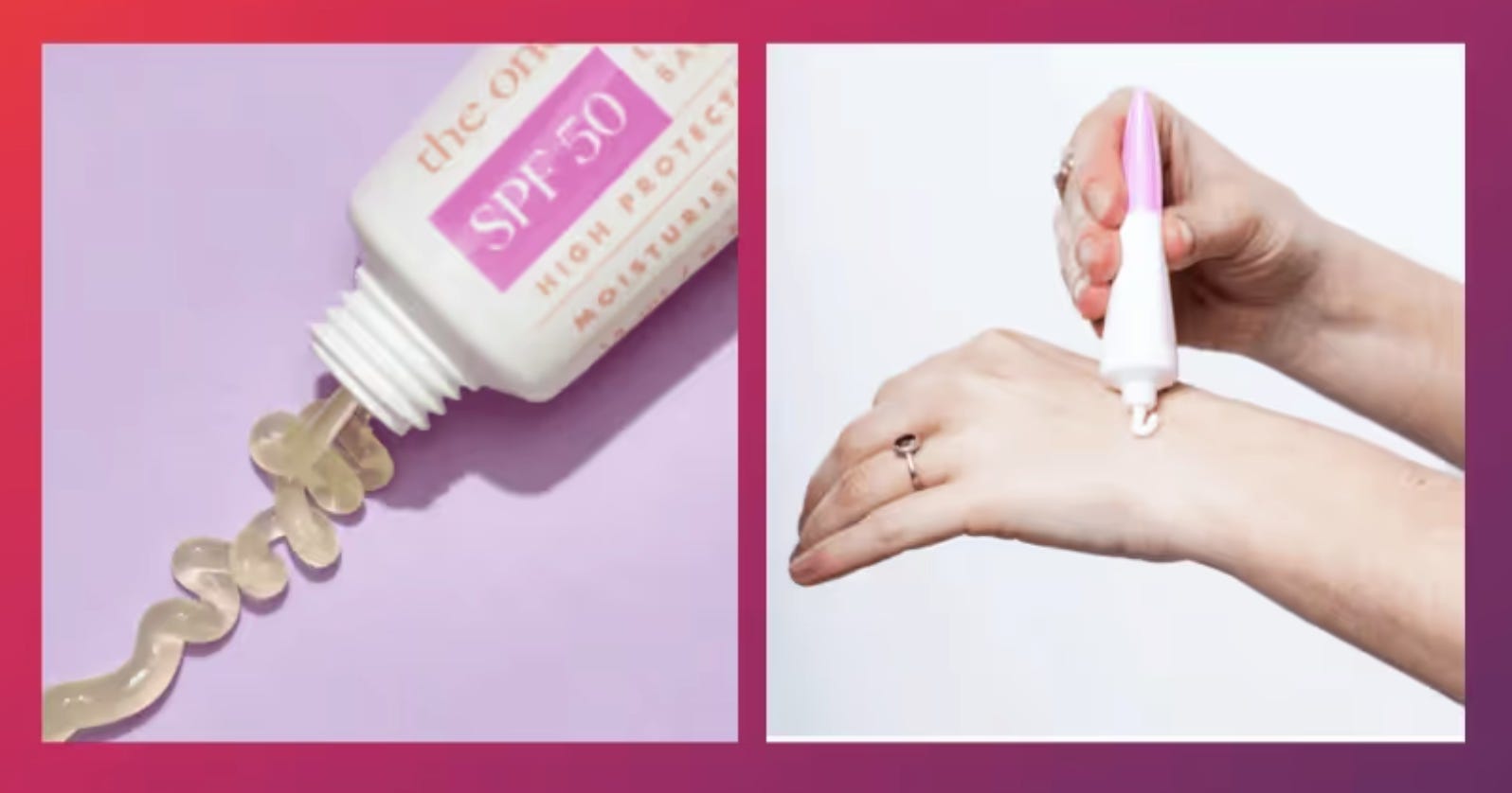
The single biggest disadvantage ecommerce has against a store shelf is that nobody can touch the product before buying. A photo that shows liquid pouring, cream stretching, or powder scattering gives the brain a partial substitute for that missing sense. It’s the same reason food photography always has steam rising or cheese pulling off a fork.
If your customer’s real hesitation is “I don’t know what this feels like,” a static photo can’t answer that. Motion can get closer. This is worth testing for skincare, beverages, food, and anything where texture is part of the value prop.
3. Mechanism diagrams
MOOD’s sleep gummy packaging shows the ingredient list with lines connecting each one to its role: magnesium for relaxation, ashwagandha for stress, CBN for the overall blend. It’s not a supplement facts panel, it’s a visual explanation of why the product does what it claims.
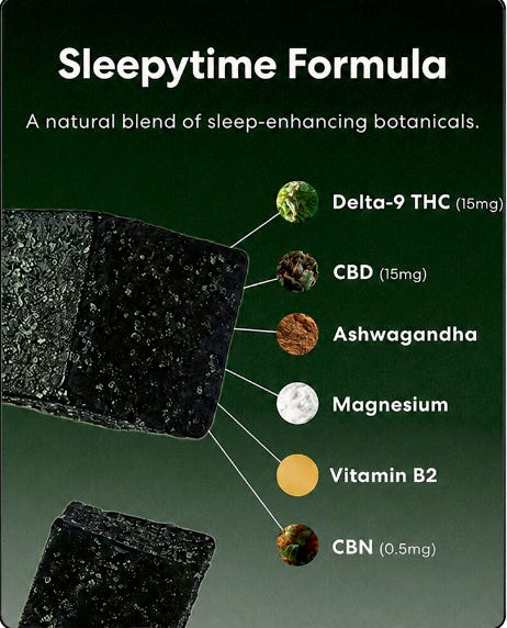
Most shoppers don’t actually read ingredient lists, they skim them and feel either reassured or suspicious. A diagram that shows the logic connecting ingredient to outcome answers the skeptical question before the customer has to ask it themselves.
This matters most in categories where buyers have been burned before, which is most of supplements, skincare actives, and anything making a “clinically backed” claim. The diagram isn’t decoration, it’s doing the work a salesperson would do on a store floor.
4. Reflective surface shots
Perfume and watch brands have used this for years: product placed on glass or polished stone so the reflection shows underneath it. It’s harder and more expensive to shoot than a flat background, and customers can tell, even if they couldn’t explain how.
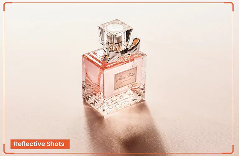
A clean reflection signals a controlled studio environment and a real production budget went into the shot. Nobody consciously thinks “this looks expensive to produce,” but the visual cue reads as premium the same way a heavy glass jar reads as premium even when the product inside costs the same to make. This is worth the extra setup time for anything priced on perceived luxury rather than pure function: fragrance, jewelry, watches, higher-end electronics.
5. Color-matched backdrops
Parch shoots its beverage cans against backgrounds pulled from the same color family as the can itself. Nothing competes with the product because there’s nothing else for the eye to sort through.
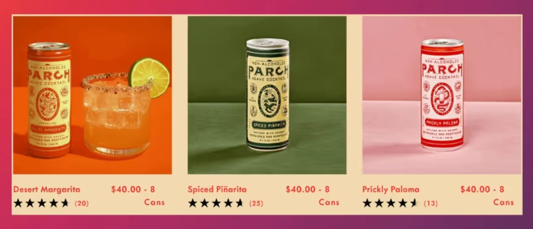
This one is quieter than the others on this list, but it’s why so many minimalist brands converge on the same style. Less visual decision-making at the image level reads as more confidence, not less effort. It’s a small lever, but it compounds across every image on a product page when the whole gallery follows the same restraint.
6. Objection-specific quote shots
MOOD again, this time with a customer quote: “Stay Asleep Without The Hangover.” Five stars, a real name, a short line that’s clearly answering something specific.
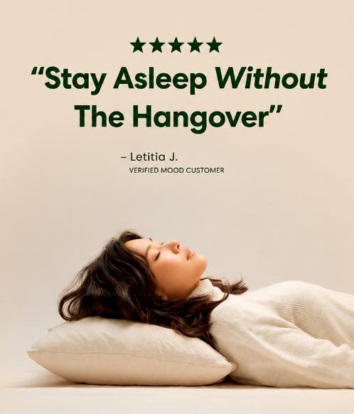
Generic five-star quote graphics stopped moving anyone a while ago, mostly because every brand has them now. A quote image only earns its place on the page when it’s aimed at the actual objection sitting in the customer’s head right before they close the tab. For a sleep gummy, that’s grogginess the next morning.
For a skincare product, it might be breakouts or irritation. The order matters here: figure out the real objection first, then go find or write toward a quote that answers it directly. A quote that just says “love this product!!” isn’t doing anything a star rating doesn’t already do.
None of these need a full reshoot to test. Pick the type that matches your product’s actual hesitation point, the one real reason customers don’t buy, and try it on your highest-traffic PDP first. A photo that answers a specific doubt will outperform a prettier photo every time.
Most stores I look at are missing four or five of these six entirely, and usually have no idea which one would move the needle most for their specific product.
Reply ‘SNAP’ and send me the link to your best-selling product page. I'll map your current images against these six types, tell you which ones you're missing, and tell you which one to shoot first and why it's the one most likely to move the needle for your product. No pitch attached, just the breakdown.